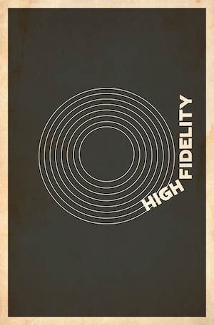
Whether it is for a logo, poster or a cover or some sorts, a well prepared and innovative design can give a tremendous boost to your aims. The following article will teach you just how to make sure that your design has the maximum impact on the viewers.
Keep it simple:
The modern age calls for a scenario where ‘less is more’. While this may sound a little clichéd it is very important to know that a good design is clear and simple. While mixing in a little color is good for obvious reasons, it is important to not get carried away with different color combinations and excessive graphic designs that make your poster, logo or whatever look cluttered and unruly.
Personally, this is one mistake that I used to make while designing something myself, for example, the logo for my football club. It was an old habit of mine to get excited with all the different things I could do on all the newest software that were on offer, so much so, that I lost sight of the actual purpose of the design which was to be bold, colorful and attractive.
This point holds well especially if you are designing a logo. If you take a look at our logo reviews you will see how many companies prefer to have less writing and a single symbol as their logo, often some abstract design that holds some metaphorical meaning which adds real value to the company’s logo.
While your company, book or club may not be popular enough to be recognized by a single symbol, which does not necessarily mean that you have to overdo the text. Keep the text nice and short and hopefully your design while attract the viewers.
Do not hesitate to do some research:
Let’s face it. You might not be the most talented artist or graphic designer or may not be educated enough in the field of arts. While you may have great ideas, everyone has difficulty putting them into context. So why not put your effort in the right direction and search for inspiration online and/or in books.
Look for techniques used by great artists or search for different logos that are really popular and try to compare them with the ideas that you have. Focus closely on the color combinations of the logo and hopefully with enough research, something will click and you will be able to put your ideas into shape and create a good design
Your font is the key to a good design:
It is imperative that your font be coherent otherwise it will put the rest of your design to shame. Most new software will offer you a wide range of fonts, ranging from those with all kinds of extensions and frills to those that are downright bland. Calligraphy fonts are no longer in style. When choosing a font, your main aim should be to make it readable and attractive and the best way to do both is to choose a simple font that shows class and grace, while remaining appeasing to the eyes.
Most designs should aim to make their logo or icon the main focus of the whole design so while a good font is the key, it should be treated as an accessory and not the main crux of the design, therefore you should aim to complement the design with a good color combination for the font and focus on keeping the font size to a level where it is readable and does not take up much space.
On the other some designs for book covers might want to make their text the main portion of their design. In this case do not be afraid to play around with your text to make them more savvy and attractive. You could have slightly different fonts for two different words to create a good contrasting effect. Here is a good example of a text that fits into the book’s theme.
Finally, make sure the design fits your theme:
This probably goes without saying that in order to create a good design your graphics must have relevance to your theme or topic. Take the example of Twitter whose logo is that of a bird, something which is relevant not only to the word, ‘Twitter’ but also to the fact that it is a social networking site.
Similarly, the color coding and text font should also go hand in hand with your theme. A design for a corporate logo might have a professional color mix, for example blue and white with a clear, crisp text. On the other hand, a gaming site can afford to mix more extra ordinary colors such as bright red or orange while including bigger, more vivid graphics.
In the end, choosing and designing the perfect design depends on how you go about your task and whether you can find the best, most aesthetic combinations for your graphics and text. Hopefully after reading this, you will have a clearer idea of what is required to create a good design. Happy designing!


