Delve into the fascinating journey of the Xerox logo, from its humble beginnings to its modern, sleek design, exploring the brand’s evolution and meaning
Xerox Corporation is based in Rochester (NY, USA) since 1906. The founders of the company ar called The Haloid Company. Then they did not even know what part of their childhood will play in the development of printing and copying technology, and what the star of the future it is prepared. During the first decades after the foundation of unremarkable company The Haloid Company produced photographic paper. The turning point in the development of the company was in 1947, when its leaders turned inventor Chester Carlson with a proposal to buy the rights to the invention of electrophotographic apparatus.
The history of Xerox’s logo began in 1937 when the company was still known as the Haloid Company. In 1961 it officially became Xerox and adopted a typeface that serves logo. In 1994, the American company breaks with austerity and chose the color red. In 2009, in order to make the logo more easily recognizable, they added a red ball adorned with a white “X”.
Xerox Corporation unveiled its new logo, a graphic identity that is the biggest visual change throughout its history. The new logo displays Xerox name in bright red and has a ball symbol next to it with lines forming the X. The creation of this logo was conducted by Interbrand .
I could write all the rubbish that its executives say the new logo means, but the truth is that what they say is worthless. Meaning of a logo is what it means in the street, the public, their users, their customers, and their stakeholders.What is the problem in this whole wave of new logos? Playback. At first, they are expensive because there are color selections, which will force to generate more economic dimensions. Talking about Xerox its different, since there already have variants. Continuing, no reproduction systems that do not work well with more solid colors, making shadows, glows, gradients and other effects that delight mediocre designers are terrible at printing, engraving, embossing, embroidery.
The Evolution of the Iconic Xerox Logo
The Original Xerox Logo: A Symbol of Innovation
In the ever-evolving world of corporate branding, few logos have stood the test of time quite like the iconic Xerox logo. This enduring symbol has not only become synonymous with the company itself, but it has also come to represent the very essence of innovation and technological advancement.
The original Xerox logo was designed in 1948 by Dr. Joseph Wilson, the company’s co-founder and first president. At the time, Xerox (then known as the Haloid Company) was a fledgling enterprise dedicated to developing and commercializing a revolutionary new technology – the xerographic process, which would later become the foundation of the modern photocopier.
The logo’s design was a reflection of Xerox’s pioneering spirit and its commitment to pushing the boundaries of what was possible. The simple, yet striking geometric shape of the “X” was intended to convey a sense of modernity, efficiency, and technical prowess. The bold, geometric form was a departure from the more ornate and traditional logos that were prevalent in the corporate world at the time, and it served to distinguish Xerox as a company that was at the forefront of innovation.
Tracing the Design Transformations of the Xerox Brand
Over the years, the Xerox logo has undergone a series of subtle yet impactful design transformations, each reflecting the company’s evolving identity and the changing demands of the market.
In the 1960s, the original “X” logo was refined and streamlined, with the shape becoming more angular and the overall design taking on a more polished and modern appearance. This update was part of a broader effort to position Xerox as a leader in the burgeoning office technology industry, and the new logo helped to convey a sense of precision, efficiency, and technological sophistication.
As Xerox continued to expand its product offerings and diversify its business in the 1970s and 1980s, the logo underwent further refinements. The color palette was updated, with the iconic blue and red hues being introduced to create a more distinctive and recognizable brand identity. The geometric “X” shape remained the central focus, but the overall design became more streamlined and minimalist, reflecting the company’s growing ambitions and its desire to present a more polished and professional image.
How the Xerox Logo Has Adapted to the Times
In the decades that followed, the Xerox logo continued to evolve, keeping pace with the rapidly changing technological landscape and the shifting demands of the market. In the 1990s and 2000s, the logo underwent a series of subtle updates, with the designers focused on maintaining the core elements of the iconic “X” shape while modernizing the overall aesthetic.
One of the most significant transformations came in the early 2000s, when Xerox unveiled a new, more dynamic and vibrant iteration of the logo. This update was a response to the company’s growing focus on digital technologies and its desire to position itself as a leader in the world of IT and software services. The new logo was characterized by a more fluid and organic interpretation of the “X” shape, with the color palette shifting to a bolder, more contemporary palette of blues and greens.
Today, the Xerox logo continues to evolve, adapting to the demands of the digital age while still preserving the core elements that have made it an iconic and instantly recognizable symbol of the brand. Whether it’s appearing on the company’s latest cutting-edge technology or gracing the pages of its marketing materials, the Xerox logo remains a testament to the enduring power of iconic design and the importance of maintaining a consistent and recognizable brand identity.
History Of The Xerox Logo
History of Xerox logo is rather large. Let’s have a look at the time variation of the representation of the company itself.
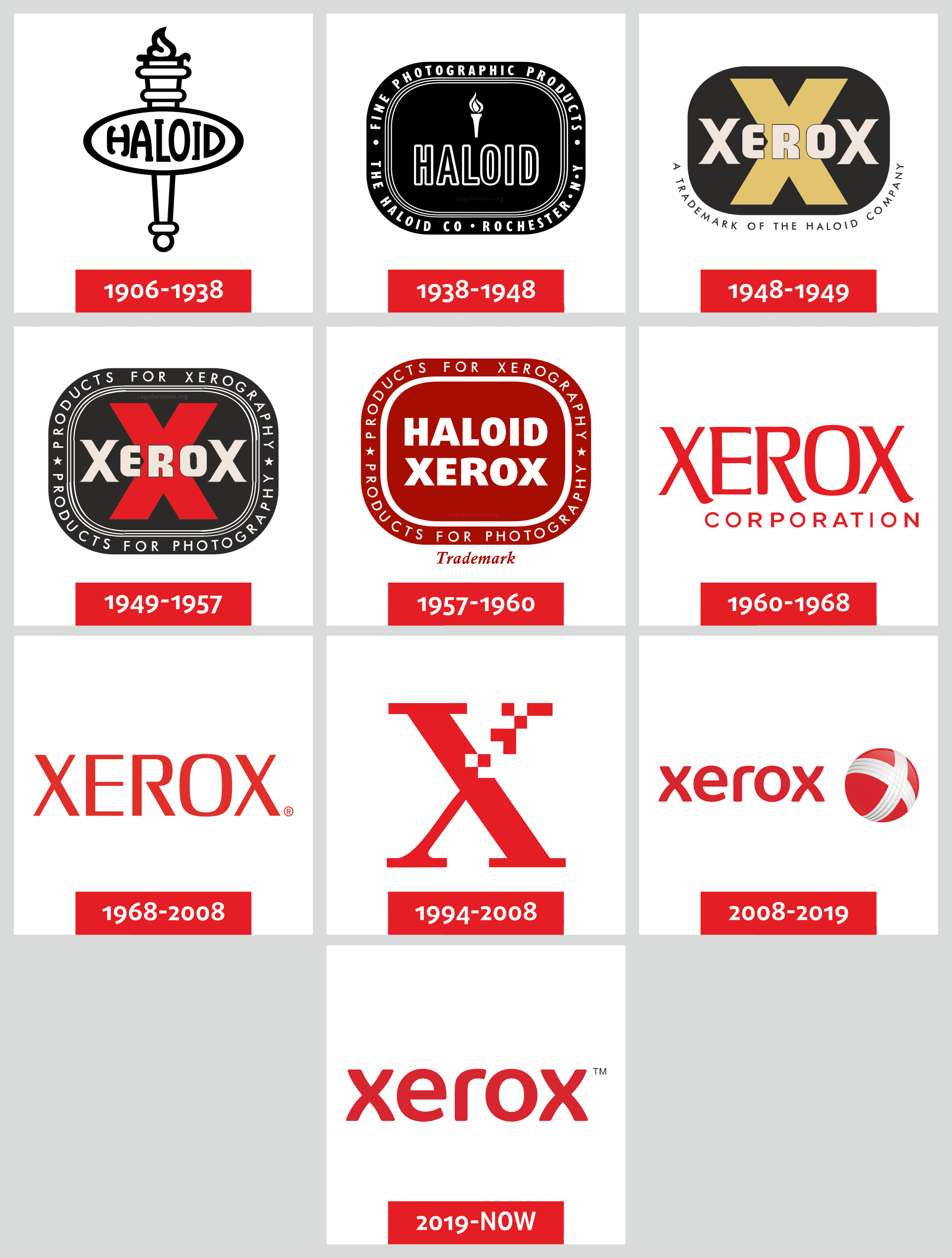
The Haloid Company’s Early Logos: Laying the Foundation (1906-1938)
![]()
The Birth of the Haloid Company and Its First Photographic Logos
The story of the Xerox logo begins with the Haloid Company, a small photographic paper manufacturer founded in 1906 in Rochester, New York. In its early days, the Haloid Company was focused on producing high-quality photographic paper and supplies, catering to the growing demand for photography in the early 20th century.
As the company grew and evolved, so too did its visual identity. The Haloid Company’s earliest logos were simple, text-based designs that reflected the company’s core business in photographic products. These early logos featured the company name in a plain, straightforward typeface, often accompanied by an illustration of a camera or other photographic equipment to reinforce the brand’s connection to the imaging industry.
Exploring the Roots of the Haloid Brand in Photographic Technology
The Haloid Company’s photographic heritage was deeply ingrained in its brand identity during this formative period. The company’s logos and branding materials often highlighted its expertise in photographic chemistry, paper, and processing, emphasizing the high-quality and reliability of its products. This emphasis on the company’s technical capabilities and commitment to innovation would later become a hallmark of the Xerox brand as well.
Laying the Groundwork for the Xerox Logo’s Future Evolution
While the Haloid Company’s early logos may have been relatively basic, they laid the foundation for the brand’s eventual transformation into the iconic Xerox logo. The company’s focus on photographic technology and its attention to quality and innovation would prove to be crucial elements as the Haloid Company evolved and eventually introduced the revolutionary Xerox photocopier.
The Invention of Xerography and the Haloid Xerox Logo (1938-1948)
![]()
Chester Carlson’s Breakthrough in Photocopying Technology
In 1938, a physicist named Chester Carlson made a groundbreaking discovery that would forever change the way people think about copying and duplicating documents. Carlson’s invention of the xerographic process, which he dubbed “electrophotography,” paved the way for the development of the world’s first practical photocopier.
The Transition from Haloid to Haloid Xerox and the First Xerox Logo
As the Haloid Company recognized the potential of Carlson’s invention, it began to shift its focus from traditional photographic products to the emerging field of electrophotography. In 1948, the company officially changed its name to Haloid Xerox, reflecting its newfound commitment to the Xerox technology and the growing importance of this revolutionary copying method.
The Haloid Xerox logo during this period was a natural evolution of the company’s previous branding, featuring the familiar Haloid name alongside the new “Xerox” moniker. This logo maintained the straightforward, text-based approach of the earlier Haloid designs, but added a sense of modernity and technological innovation with the inclusion of the Xerox name.
Establishing the Xerox Brand in the Photocopier Market
As the Haloid Xerox company worked to commercialize and popularize the Xerox photocopier, the Haloid Xerox logo became an increasingly important visual representation of the brand. The logo helped to establish Xerox as a leader in the emerging photocopier industry, positioning the company as a reliable and innovative provider of cutting-edge document technology.
The Rise of Xerox and the Iconic “X” Logo (1948-1949)
![]()
Xerox Dominates the Photocopier Industry
The success of the Xerox photocopier was nothing short of meteoric. By the late 1940s, the Haloid Xerox company had firmly established itself as the dominant player in the photocopier market, with its innovative technology and reliable products capturing the attention of businesses and consumers alike.
The Significance of the Distinctive “X” Shape in the New Logo
As the Xerox brand continued to grow and gain mainstream recognition, the company decided to update its visual identity to better reflect its position as a market leader. In 1948, Haloid Xerox introduced a new logo that would become one of the most iconic and instantly recognizable corporate symbols of the 20th century: the Xerox “X.”
The distinctive “X” shape was more than just a stylized letter; it represented the core of the Xerox technology, the “X” factor that made the company’s photocopiers so revolutionary and unique. The bold, angular design of the Xerox “X” conveyed a sense of strength, precision, and technological prowess, perfectly aligning with the brand’s reputation for innovation and industry leadership.
Solidifying Brand Recognition with the Xerox Wordmark
Alongside the striking “X” symbol, the Xerox logo also featured the company’s name in a clean, sans-serif typeface. This wordmark element helped to reinforce the Xerox brand identity, ensuring that the company’s name would be clearly and prominently displayed alongside the iconic “X” graphic.
The combination of the powerful “X” symbol and the straightforward Xerox wordmark created a logo that was both visually striking and instantly recognizable. This balance between the abstract graphic and the clear brand name would become a hallmark of the Xerox logo, helping to cement the company’s position as a leader in the photocopier industry.
Refining the Xerox Logo for the Modern Era (1949-1957)
![]()
Adapting the Xerox Logo to Changing Business Needs
As the Xerox brand continued to grow and evolve, the company’s logo also underwent a series of subtle refinements and updates to better reflect the company’s changing priorities and market position. Throughout the 1950s, the Xerox logo went through a process of gradual refinement, with the “X” symbol and wordmark being adjusted and refined to maintain a consistent and modern appearance.
Exploring the Geometric Elements and Color Choices
One of the key aspects of the Xerox logo’s evolution during this period was the company’s exploration of different geometric elements and color choices. The angular, almost architectural “X” symbol remained a constant, but the precise form and proportions of the graphic were tweaked and refined over time. Similarly, the Xerox wordmark was adjusted, with the typeface and spacing being optimized for maximum legibility and visual impact.
In terms of color, the Xerox logo during this era typically featured the iconic “Xerox blue” hue, a rich and distinctive shade that became closely associated with the brand. This bold, vibrant blue helped to reinforce the Xerox brand’s identity and convey a sense of professionalism, reliability, and technological prowess.
Preparing the Xerox Brand for Rapid Expansion
As the Xerox photocopier continued to dominate the market and the company’s reach and influence grew, the refinement of the Xerox logo during this period was essential in preparing the brand for its rapid expansion. The consistent, modern, and visually striking logo helped to solidify Xerox’s position as a global leader in the document technology industry, paving the way for the company’s continued success in the decades to come.
The Chermayeff & Geismar Redesign: Modernizing the Xerox Look (1957-1960)
![]()
Lippincott’s Original Logo and the Need for Refinement
In 1957, Xerox decided to undertake a comprehensive rebranding effort, with the goal of modernizing the company’s visual identity and positioning it for future growth. The company turned to the renowned design firm Lippincott & Margulies, who had previously created the iconic Xerox “X” logo, to lead the redesign project.
While the Lippincott-designed Xerox logo had served the company well for nearly a decade, the rapid pace of technological change and the growing importance of visual branding in the business world prompted Xerox to seek a more refined and modernized logo design.
Chermayeff & Geismar’s Iconic Redesign of the Xerox Logo
Lippincott brought in the talented design duo of Ivan Chermayeff and Tom Geismar to lead the Xerox logo redesign project. Chermayeff and Geismar, renowned for their work in corporate identity and branding, brought a fresh perspective and a keen eye for modern design to the Xerox logo.
The resulting logo design was a masterful evolution of the original “X” symbol, retaining the core graphic element while streamlining and refining its form. The new Xerox logo featured a more geometric, almost architectural “X” shape, with clean lines and a stronger sense of balance and proportion.
The Impact of the Updated Xerox Wordmark and Branding
In addition to the updated “X” symbol, the Chermayeff & Geismar redesign also introduced a new, more modern wordmark for the Xerox name. The clean, sans-serif typeface and careful spacing between the letters helped to create a cohesive and visually striking brand identity.
The combined impact of the refined “X” symbol and the updated Xerox wordmark was significant. The new logo design conveyed a sense of technological sophistication, precision, and forward-thinking that aligned perfectly with Xerox’s position as a leader in the document technology industry. The Chermayeff & Geismar redesign helped to cement the Xerox brand’s reputation for innovation, reliability, and excellence, paving the way for the company’s continued growth and success in the decades to come.
The Xerox Logo in the Digital Age (1960-1968)
![]()
Adapting the Xerox Logo for the Emerging Digital Landscape
As the 1960s dawned, the world was on the cusp of a digital revolution, and Xerox found itself at the forefront of this technological transformation. The company’s pioneering work in areas like computer science, graphical user interfaces, and digital document processing was rapidly changing the way people interacted with information and technology.
In this rapidly evolving landscape, the Xerox logo needed to adapt and evolve to remain relevant and resonant. The company’s design team worked tirelessly to ensure that the iconic “X” symbol and wordmark could seamlessly translate to the emerging digital mediums and platforms that were becoming increasingly important in the business world.
Maintaining Brand Consistency Across Evolving Technologies
One of the key challenges for Xerox during this period was maintaining a consistent and recognizable brand identity as the company’s product offerings and technological capabilities expanded. From the first standalone photocopiers to the development of cutting-edge computer systems and software, Xerox had to ensure that its visual branding could adapt and scale to accommodate the company’s growing portfolio of digital solutions.
Leveraging the Iconic Xerox Logo in the Computer Era
As Xerox made significant inroads into the burgeoning computer industry, the company’s iconic logo became an even more important element of its brand identity. The instantly recognizable “X” symbol and streamlined wordmark helped to position Xerox as a leader in the digital revolution, reinforcing the company’s reputation for innovation and technological expertise.
The Xerox logo’s ability to seamlessly translate to digital mediums, from computer monitors to early web pages, was a testament to the timeless design and enduring appeal of the brand’s visual identity. This adaptability and versatility would prove to be crucial as Xerox continued to evolve and expand its reach in the rapidly changing technological landscape of the 1960s and beyond.
The Xerox Logo in the Changing Marketplace (1968-2008)
![]()
In 1968, the design company Chermayeff & Geismar updated the logo of Xerox, and it’s logo in sovem Inscription becomes a classic brand logo for almost 40 years.
Evolving the Xerox Logo to Reflect Shifting Business Priorities
As Xerox’s business continued to evolve and diversify throughout the late 20th century, the company’s logo also underwent a series of updates and refinements to keep pace with the changing marketplace. From the introduction of new product lines and services to the company’s increasing focus on global expansion, the Xerox logo had to adapt to reflect the brand’s shifting priorities and market positioning.
Integrating the “Document Company” Tagline into the Logo
One of the most significant changes to the Xerox logo during this period was the integration of the “Document Company” tagline. As Xerox sought to position itself as a provider of comprehensive document solutions, rather than just a manufacturer of photocopiers, the inclusion of this tagline helped to communicate the breadth and depth of the company’s offerings.
Preparing Xerox for the Transition to Digital Document Solutions
As the world moved increasingly towards digital document processing and management, Xerox had to ensure that its logo and branding remained relevant and resonant. The company’s designers worked to refine and update the Xerox logo, incorporating elements that conveyed the brand’s expertise in areas like digital imaging, workflow optimization, and IT services.
Through these gradual updates and refinements, the Xerox logo remained a powerful and recognizable symbol of the company’s technological prowess and market leadership, even as the document industry underwent a dramatic transformation.
The 1994 Rebrand: Introducing the Red Xerox Logo (1994-2008)
![]()
In 1994, Landor presented their version – the first red logo. Then there was the tagline “The Document Company” dispayed along with the red logo.
The Shift to a Red Color Palette and Its Implications
In 1994, Xerox unveiled a bold and dramatic update to its iconic logo, introducing a new red color palette that would become a defining element of the brand’s visual identity for the next 14 years. This shift from the traditional Xerox blue to a vibrant, eye-catching red was a strategic move to help the company stand out in an increasingly crowded and competitive marketplace.
The decision to adopt a red logo was not just a superficial change; it reflected a deeper shift in Xerox’s business strategy. The red color palette was intended to convey a sense of energy, innovation, and forward-thinking, aligning the brand with a new era of technological advancement and customer-centric solutions.
Aligning the Xerox Logo with a Focus on Innovation and Partnerships
Alongside the visual update, the 1994 Xerox rebrand also saw the company refine its positioning and messaging to better reflect its growing focus on innovation, collaboration, and strategic partnerships. The red logo became a symbol of Xerox’s commitment to developing cutting-edge technologies and working closely with customers and industry partners to drive progress and growth.
Maintaining Brand Relevance in a Rapidly Changing Landscape
As the document technology industry continued to evolve rapidly, the 1994 Xerox logo redesign helped the company to stay ahead of the curve and maintain its position as a market leader. The bold, vibrant red color palette and the brand’s renewed emphasis on innovation and partnership resonated with customers and industry peers alike, ensuring that the Xerox name remained synonymous with excellence and progress in the digital age.
In 2004, the slogan was removed from the logo.
Xerox Redefines Its Identity: The 2008 Logo Redesign (2008-2019)
![]()
And finally, the crowning of historical transformation is the new Xerox logo idea, created by designers at Interbrand. In January 2009, Xerox Corporation announced the most radical renewal of visual identity for the history of the brand. The new logo, designed by brand consultancy Interbrand is the full transfer of modern values, innovation and above all client-orented image Xerox. According to logo designer review, energetic new logo emphasizes the contemporary style of the brand, as it is less formal and more lively. It depicts the appropriate “business today,” keep the story and has great prospects for the future.
Distancing Xerox from the “Copier Company” Perception
By the late 2000s, Xerox had once again found itself at a critical juncture in its evolution as a company. While the iconic “X” symbol and the bold red color palette had served the brand well for decades, there was a growing perception that Xerox was still primarily identified as a “copier company,” rather than a provider of comprehensive document management and IT services.
Recognizing the need to redefine its identity and better communicate the breadth of its capabilities, Xerox embarked on a comprehensive rebrand effort in the late 2000s, with the goal of positioning the company as a leader in the rapidly evolving world of digital document solutions.
In 2002 vordmark was slightly changed. The ‘X’ was replaced by Xerox again along with a little changes in position.
Interbrand’s Redesign and the Introduction of the “Digital X”
Xerox turned to the renowned design firm Interbrand to lead the company’s logo redesign and rebranding initiative. Interbrand’s approach centered on creating a visual identity that would help Xerox shed its outdated “copier company” image and embrace a more forward-thinking, technology-driven identity.
The result was a dramatically updated Xerox logo that retained the iconic “X” symbol but gave it a distinct digital twist. The new “Digital X” logo featured a more angular, geometric interpretation of the “X,” with clean lines and a sleek, contemporary aesthetic. This modernized graphic, combined with a refined wordmark and a new, more versatile color palette, helped to position Xerox as a dynamic, innovative, and technologically advanced company.
Adapting the Xerox Logo for the Modern, Digital Marketplace
The 2008 Xerox logo redesign was a bold and strategic move, aimed at ensuring the company’s visual identity remained relevant and resonant in an increasingly digital world. By embracing a more modern, technology-focused aesthetic, Xerox was able to better communicate its evolution from a traditional hardware manufacturer to a provider of comprehensive digital document solutions and IT services.
This logo update was crucial in helping Xerox navigate the changing landscape of the document technology industry, allowing the brand to remain competitive and attractive to a new generation of customers and clients who were increasingly focused on digital transformation and cloud-based solutions.
The Xerox Logo in the Contemporary Era (2019-Present)
![]()
Exploring Innovative Ways to Reinvent the Iconic Xerox Logo
As Xerox continues to evolve and adapt to the ever-changing needs of the document technology industry, the company’s iconic logo has also undergone a series of innovative updates and refinements. In recent years, Xerox has explored new ways to reinvent and reinterpret the classic “X” symbol, experimenting with different color schemes, graphic elements, and design approaches to keep the brand feeling fresh, modern, and relevant.
Maintaining Brand Relevance and Resonance in a Changing World
One of the key challenges Xerox faces in the contemporary era is ensuring that its visual identity remains resonant and meaningful in a rapidly shifting business landscape. As the company continues to diversify its product offerings, expand its global reach, and adapt to emerging technologies, the Xerox logo must be able to effectively communicate the brand’s value proposition and core capabilities to a wide range of stakeholders.
The Continued Evolution of the Xerox Brand and Its Visual Identity
Through a process of ongoing refinement and innovation, the Xerox logo has evolved to become a true icon of the document technology industry. As Xerox navigates the challenges and opportunities of the contemporary business landscape, the company’s visual identity remains a crucial element in maintaining brand relevance and resonance.
In recent years, Xerox has explored a variety of creative approaches to updating and reinterpreting the iconic “X” symbol. From subtle tweaks to the graphic elements and color palette to more dramatic reimaginings of the logo, the company has demonstrated a willingness to experiment and push the boundaries of its visual branding.
One particularly noteworthy example of Xerox’s logo evolution is the introduction of the “Adaptive X” concept. This innovative approach to the classic “X” symbol features a dynamic, responsive graphic that can adapt and transform to better suit different digital and physical applications. The Adaptive X logo can morph and flex to accommodate various screen sizes, display formats, and branding touchpoints, ensuring that the Xerox identity remains cohesive and impactful across a wide range of mediums.
Another interesting development in the Xerox logo’s contemporary iteration is the company’s exploration of more abstract, conceptual interpretations of the “X” symbol. By stripping away the literal representation of the letter and focusing on the inherent geometric and visual properties of the shape, Xerox has been able to create logos that evoke a sense of modernity, innovation, and technological prowess without relying solely on the recognizable wordmark.
These experimental approaches to the Xerox logo have allowed the brand to maintain a sense of continuity and familiarity while also staying ahead of the curve and adapting to the evolving needs of the document technology industry. As Xerox continues to redefine its identity and position itself as a leader in areas like digital workflow optimization, cloud-based solutions, and IT services, the company’s visual branding will undoubtedly continue to evolve and transform to reflect these changing priorities.
Ultimately, the Xerox logo’s journey from the company’s earliest photographic roots to its current status as a globally recognized icon of innovation and excellence is a testament to the enduring power of thoughtful, strategic branding. By consistently reinventing and refining its visual identity, Xerox has managed to maintain a strong, cohesive brand that resonates with customers, partners, and industry stakeholders alike.
As Xerox looks towards the future, the company’s commitment to innovative logo design and branding will undoubtedly play a crucial role in shaping the next chapter of the Xerox story. Whether through further refinements of the classic “X” symbol or the introduction of entirely new visual concepts, the Xerox logo will continue to evolve and adapt, reflecting the company’s unwavering dedication to technological progress, customer-centric solutions, and industry-leading excellence.
The Xerox Logo and the Fuji Xerox Partnership
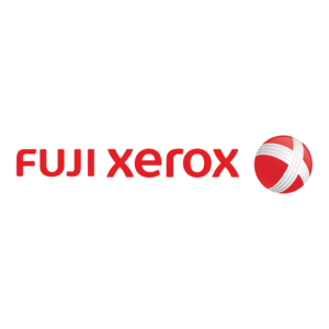
Fujifilm Business Innovation, previously known as Fuji Xerox, has a rich history. Established in 1962 as a 50:50 joint venture between Fujifilm and Rank Xerox (later absorbed into Xerox Corporation), Fuji Xerox initially served as a distributor for Rank Xerox products. However, it later transitioned into independent research and development, introducing its own proprietary xerographic machines and devices. For decades, Fuji Xerox has been instrumental in advancing document processing technologies. They have contributed to the innovation and manufacturing of various devices marketed by Xerox Corporation. Some of their key milestones include the creation of the world’s smallest copier, the FX2200, in 1973, and the introduction of the ‘Xero Printer 100’ in 1987, which was recognized as the world’s first multifunction printer/copier. In 2019, Fujifilm acquired the remaining 25% stake from Xerox, assuming full ownership of Fuji Xerox. To reflect this change, Fuji Xerox was renamed Fujifilm Business Innovation Corporation in April 2021. The company’s corporate logo has evolved over time to reflect these changes. The original Fuji Xerox logo featured the Fuji name and Xerox’s iconic ‘X’ symbol. After Fujifilm’s full acquisition, the logo was updated to the current ‘FUJIFILM Business Innovation’ branding. In summary, the Fuji Xerox logo has transitioned from the original joint venture branding to the current Fujifilm Business Innovation identity, reflecting the company’s history and evolution over the past six decades.
Integral to the story of the iconic Xerox logo is the company’s longstanding partnership with Fuji Xerox, a joint venture that has played a crucial role in shaping the global reach and evolution of the Xerox brand. Established in 1962, the Fuji Xerox collaboration has allowed Xerox to leverage the technological expertise and manufacturing capabilities of its Japanese counterpart, while also expanding the company’s presence and influence in key international markets.
The Fuji Xerox partnership has had a profound impact on the Xerox logo and visual identity over the years. As the joint venture grew and Xerox’s global footprint expanded, the company’s designers had to ensure that the logo could seamlessly adapt to different cultural contexts and customer preferences around the world. This process of adapting the Xerox logo for diverse international markets has involved subtle refinements to the graphic elements, color palettes, and stylistic approaches to ensure the brand maintains a cohesive, recognizable identity while also resonating with local audiences.
One particularly notable example of the Xerox logo’s adaptation for the Fuji Xerox partnership can be seen in the company’s branding for the Asian market. In certain regions, the Xerox wordmark has been rendered in Japanese or Chinese scripts, allowing the logo to communicate the brand’s expertise and heritage in a more culturally relevant manner. Additionally, the color palette of the Xerox logo has been tailored to specific markets, with certain iterations featuring a more muted, subdued aesthetic to better align with local design sensibilities.
These strategic adjustments to the Xerox logo have been crucial in maintaining the brand’s consistency and recognition on a global scale, while also ensuring that the visual identity remains resonant and meaningful for Xerox’s diverse international customer base. As the Fuji Xerox partnership continues to evolve and the company’s global footprint expands, the Xerox logo will undoubtedly continue to adapt and transform, serving as a unifying, adaptable symbol of the brand’s technological prowess, industry leadership, and commitment to excellence worldwide.
The Meaning and Symbolism Behind the Xerox Logo
Decoding the Geometric Elements of the Xerox Logo
At the heart of the Xerox logo is a bold, geometric “X” shape that has become synonymous with the brand. This striking visual element is more than just a stylistic choice – it is a deliberate and carefully crafted design that holds deep symbolic meaning and significance.
The “X” shape is a powerful and versatile symbol that has been used throughout history to represent a wide range of concepts, from the intersection of two lines to the concept of a fundamental unknown or variable. In the context of the Xerox logo, the “X” shape serves to convey a sense of precision, efficiency, and technological prowess – qualities that have been central to the company’s identity since its inception.
The angular, almost architectural nature of the “X” shape also suggests a sense of stability, strength, and reliability – qualities that are essential for a company operating in the high-stakes world of office technology and IT services. The symmetry and balance of the design further reinforce the notion of Xerox as a reliable and trustworthy partner for its customers.
The Significance of the Distinctive “X” Shape
But the “X” shape in the Xerox logo is more than just a geometric form – it is a symbol that holds deep cultural and linguistic significance. In many languages and cultures, the “X” shape is associated with concepts of transformation, change, and the crossing of boundaries – all of which are central to the Xerox story.
The “X” shape is also commonly used as a symbol of negation or the cancellation of something, which in the context of Xerox’s history as a pioneer of the xerographic process, can be seen as a nod to the company’s role in disrupting traditional office technology and paving the way for a new era of photocopying and document management.
Furthermore, the “X” shape is often used to signify the intersection of two distinct entities or concepts, which in the case of Xerox, can be seen as a metaphor for the company’s ability to bridge the gap between cutting-edge technology and the practical needs of its customers.
Exploring the Color Choices and Their Implications
In addition to the iconic “X” shape, the Xerox logo is also defined by its distinctive color palette, which has evolved over the years but has always remained true to a core set of hues.
The primary colors used in the Xerox logo are blue and red, which together create a striking and memorable visual identity. These colors are not chosen arbitrarily, but rather they hold deep symbolic meaning and cultural significance.
Blue, for example, is often associated with qualities like trust, stability, and professionalism – all of which are essential for a company like Xerox that operates in the high-stakes world of office technology. The use of blue in the logo also serves to position Xerox as a reliable and trustworthy partner for its customers, conveying a sense of authority and expertise.
The inclusion of red, on the other hand, adds a sense of energy, dynamism, and innovation to the Xerox brand. Red is a color that is often associated with passion, excitement, and a pioneering spirit – qualities that have been central to Xerox’s identity since its inception. The combination of blue and red in the logo creates a powerful visual contrast that helps to reinforce the company’s dual identity as both a trusted partner and a forward-thinking innovator.
Ultimately, the Xerox logo is a masterful blend of geometric form, symbolic meaning, and strategic color choices – all of which work together to create a visual identity that is instantly recognizable, highly memorable, and deeply aligned with the company’s core values and brand positioning.
The Impact of the Xerox Logo on Brand Recognition
How the Xerox Logo Became an Instantly Recognizable Icon
The Xerox logo has become one of the most instantly recognizable corporate symbols in the world, a testament to the power of consistent and strategic branding.
Over the course of its nearly 75-year history, the Xerox logo has been carefully crafted and refined to create a visual identity that is both distinctive and highly memorable. The bold, geometric “X” shape, combined with the company’s signature blue and red color palette, has become a hallmark of the Xerox brand, a visual shorthand that instantly conjures up images of innovation, reliability, and technological prowess.
But the Xerox logo’s rise to iconic status is not just a matter of good design – it is also the result of the company’s relentless efforts to build and maintain a consistent brand identity across all of its marketing and communications channels.
From the earliest days of the company’s history, Xerox has been meticulous in its application of the logo, ensuring that it appears prominently and consistently on everything from product packaging and marketing materials to the company’s physical offices and digital properties. This unwavering commitment to brand consistency has helped to cement the Xerox logo’s status as a universally recognized symbol of the company’s identity and values.
The Role of Consistent Branding in Xerox’s Success
The Xerox logo’s impact on brand recognition is not just a matter of aesthetics – it has also played a crucial role in the company’s overall business success.
By maintaining a consistent and instantly recognizable visual identity, Xerox has been able to build a strong and enduring brand that resonates with customers and stakeholders alike. The Xerox logo has become a shorthand for the company’s commitment to innovation, quality, and reliability, and it has helped to position the brand as a trusted partner in the world of office technology and IT services.
This strong brand recognition has, in turn, translated into tangible business benefits for Xerox. The company’s consistent and strategic use of the logo in its marketing and advertising efforts has helped to drive customer loyalty and repeat business, as well as to attract new customers who are drawn to the company’s reputation for excellence.
Moreover, the Xerox logo has also played a key role in the company’s efforts to expand into new markets and product categories. By leveraging the power of the iconic “X” shape and the company’s signature color palette, Xerox has been able to quickly and effectively establish a presence in new areas, building on the strong brand recognition and reputation that it has developed over the course of its history.
Analyzing the Longevity and Adaptability of the Xerox Logo
One of the most remarkable aspects of the Xerox logo’s impact on brand recognition is its remarkable longevity and adaptability.
Despite the numerous changes and transformations that the logo has undergone over the years, the core elements of the “X” shape and the blue and red color palette have remained remarkably consistent. This consistency has allowed the Xerox logo to become a deeply ingrained and recognizable part of the company’s overall brand identity, transcending the specific products or services that it represents at any given time.
At the same time, the Xerox logo has also demonstrated a remarkable ability to adapt and evolve in response to changing market conditions and customer needs. As the company has expanded its product offerings and diversified its business activities, the logo has been updated and refined to reflect these changes, while still maintaining a strong connection to the company’s core identity and values.
This combination of longevity and adaptability has been a key factor in the Xerox logo’s enduring impact on brand recognition. By maintaining a consistent visual identity while also evolving to meet the changing demands of the market, Xerox has been able to build a brand that is both instantly recognizable and deeply relevant to its customers.
Ultimately, the Xerox logo’s powerful influence on brand recognition is a testament to the company’s commitment to strategic and consistent branding, as well as the enduring power of iconic design. As Xerox continues to navigate the ever-changing landscape of office technology and IT services, the Xerox logo will undoubtedly remain a central and defining element of the company’s identity and success.
The Design Process and Evolution of the Xerox Logo
The Inception of the Original Xerox Logo
The story of the Xerox logo’s design and evolution is a fascinating one, tracing the company’s journey from a pioneering start-up to a global leader in office technology and IT services.
The original Xerox logo was created in 1948 by Dr. Joseph Wilson, the company’s co-founder and first president. At the time, Xerox (then known as the Haloid Company) was a small, ambitious enterprise dedicated to developing and commercializing a revolutionary new technology – the xerographic process, which would later become the foundation of the modern photocopier.
Wilson’s design for the Xerox logo was a bold and striking departure from the more traditional and ornate corporate logos that were prevalent in the mid-20th century. The central element was a simple, geometric “X” shape, which was intended to convey a sense of modernity, efficiency, and technical prowess.
The choice of the “X” shape was a deliberate one, rooted in both the practical and symbolic needs of the Haloid Company. Functionally, the “X” shape was intended to evoke a sense of precision and accuracy – qualities that were essential for a company working on the cutting edge of office technology.
But the “X” shape also held deep symbolic meaning for the company. As a universal symbol of transformation, change, and the crossing of boundaries, the “X” shape was a perfect fit for a company that was pioneering a disruptive new technology and pushing the boundaries of what was possible in the world of office equipment.
Refinements and Iterations: Tracking the Logo’s Transformation
Over the course of the following decades, the Xerox logo underwent a series of subtle yet impactful refinements and updates, each reflecting the company’s evolving identity and the changing demands of the market.
In the 1960s, the original “X” logo was streamlined and modernized, with the shape becoming more angular and the overall design taking on a more polished and sophisticated appearance. This update was part of a broader effort to position Xerox as a leader in the burgeoning office technology industry, and the new logo helped to convey a sense of technical precision and cutting-edge innovation.
As Xerox continued to expand its product offerings and diversify its business in the 1970s and 1980s, the logo underwent further refinements. The color palette was updated, with the iconic blue and red hues being introduced to create a more distinctive and recognizable brand identity. The geometric “X” shape remained the central focus, but the overall design became more streamlined and minimalist, reflecting the company’s growing ambitions and its desire to present a more polished and professional image.
The Influence of Design Trends on the Xerox Logo
Throughout these transformations, the Xerox logo has always managed to maintain a strong connection to its original design, while also adapting to the changing trends and aesthetic preferences of the time.
In the 1990s and 2000s, for example, the logo underwent a series of subtle updates that reflected the growing influence of digital design and the increasing importance of creating a cohesive and visually appealing brand identity across multiple platforms.
These updates included a more fluid and organic interpretation of the “X” shape, as well as a bolder and more vibrant color palette that was better suited to the digital landscape. The designers also placed a greater emphasis on ensuring that the logo would work seamlessly across a wide range of digital and physical media, from website graphics to product packaging.
Throughout these transformations, the Xerox logo has consistently managed to strike a balance between maintaining its core identity and adapting to the changing demands of the market. This ability to evolve while remaining true to its roots has been a key factor in the logo’s enduring success and its status as one of the most iconic and recognizable corporate symbols in the world.
The Xerox Logo in the Digital Age
Adapting the Xerox Logo for the Modern, Digital Landscape
As the world has become increasingly digital and technology-driven, the Xerox logo has had to adapt to a rapidly evolving landscape. In the age of social media, online marketing, and digital product experiences, the company’s iconic symbol has had to work harder than ever to maintain its relevance and impact.
One of the key challenges has been ensuring that the Xerox logo maintains its distinctive visual identity and brand recognition in the digital realm, where it must compete with a vast array of other logos and visual elements vying for the attention of consumers.
To meet this challenge, Xerox has undertaken a concerted effort to refine and optimize the logo for the digital age. This has involved everything from updating the color palette and typography to ensure optimal readability and visibility on digital screens, to exploring new, more dynamic and interactive interpretations of the iconic “X” shape.
Throughout these adaptations, however, Xerox has remained steadfast in its commitment to preserving the core elements of the logo that have made it so successful over the years. The bold, geometric “X” shape and the company’s signature blue and red color palette have remained central to the brand’s visual identity, ensuring that the Xerox logo continues to be instantly recognizable and deeply connected to the company’s core values and history.
Maintaining Brand Consistency Across Digital Platforms
As Xerox has navigated the challenges of the digital landscape, one of the company’s key priorities has been maintaining a consistent and cohesive brand identity across all of its digital platforms and touchpoints.
This has involved a meticulous and coordinated effort to ensure that the Xerox logo appears consistently and prominently across the company’s website, social media channels, online advertising campaigns, and digital product experiences. By leveraging a range of design techniques and digital optimization strategies, Xerox has been able to ensure that the logo’s visual impact and brand recognition remain strong and consistent, even in the fast-paced and constantly evolving world of digital media.
One of the key strategies that Xerox has employed in this effort is the development of comprehensive brand guidelines and design standards that outline the precise specifications for how the logo should be used and applied across all digital platforms. These guidelines cover everything from the appropriate color palette and typography to the specific sizing and placement of the logo, ensuring that the brand’s visual identity remains consistent and recognizable no matter where it appears.
Additionally, Xerox has invested heavily in building a robust and centralized digital asset management system that allows the company to efficiently store, organize, and distribute its logo and other branding assets across its various digital touchpoints. This has helped to ensure that the Xerox logo is always readily available and properly applied, further reinforcing the company’s commitment to brand consistency and recognition.
Leveraging the Iconic Xerox Logo in the Age of Social Media
As the world has become increasingly interconnected and social media-driven, the Xerox logo has also had to adapt to the unique demands and opportunities of this new digital landscape.
One of the key ways that Xerox has leveraged the power of its iconic logo in the social media age is through strategic brand partnerships and collaborations. By aligning the Xerox brand with other high-profile companies and influencers, Xerox has been able to extend the reach and visibility of its logo, exposing it to new audiences and reinforcing its status as a globally recognized symbol of innovation and technological prowess.
For example, Xerox has partnered with leading social media platforms like Twitter and Instagram to create exclusive branded content and social media campaigns that feature the company’s iconic logo prominently. These collaborations have allowed Xerox to engage with its target audience in a more dynamic and interactive way, tapping into the viral potential of social media to amplify the reach and impact of its brand identity.
Additionally, Xerox has leveraged the power of user-generated content and social media influencers to further bolster the visibility and recognition of its logo. By encouraging customers, partners, and brand advocates to share content featuring the Xerox logo, the company has been able to foster a sense of community and brand loyalty that extends far beyond its traditional marketing and advertising channels.
This strategic approach to social media has been instrumental in helping Xerox maintain the relevance and resonance of its iconic logo in the digital age. By seamlessly integrating the logo into the fast-paced and highly visual world of social media, the company has been able to ensure that its brand identity remains as iconic and impactful as ever, even as the technological landscape continues to evolve.
The Xerox Logo and Corporate Identity
How the Xerox Logo Shapes the Company’s Public Perception
The Xerox logo is more than just a visual representation of the company – it is a powerful symbol that shapes the public’s perception of the Xerox brand and its corporate identity.
At its core, the Xerox logo conveys a sense of reliability, precision, and technological innovation – qualities that are deeply aligned with the company’s core values and positioning. The bold, geometric “X” shape and the striking blue and red color palette communicate a sense of strength, stability, and authority, positioning Xerox as a trusted partner and industry leader.
But the impact of the Xerox logo goes beyond just visual aesthetics – it also plays a crucial role in shaping the public’s understanding of the company’s broader corporate identity and culture. The logo’s association with qualities like efficiency, reliability, and technical prowess helps to reinforce Xerox’s reputation as a company that is at the forefront of office technology and IT solutions.
Moreover, the Xerox logo’s longevity and consistent application across the company’s various touchpoints and communications channels have helped to cement its status as a symbol of Xerox’s enduring commitment to innovation and excellence. By maintaining a strong and recognizable visual identity, Xerox has been able to cultivate a sense of trust and credibility with its customers and stakeholders, solidifying its position as a leading player in the highly competitive world of office technology and IT services.
Integrating the Logo into Xerox’s Broader Branding Efforts
The Xerox logo is not merely a standalone visual element – it is a fundamental component of the company’s broader branding and marketing efforts, serving as a unifying thread that connects the various facets of the Xerox brand and corporate identity.
Across Xerox’s product lines, marketing materials, and digital platforms, the logo is deployed strategically to create a cohesive and consistent visual identity that reinforces the company’s core values and positioning. From the sleek and modern product designs that feature the Xerox logo prominently, to the company’s cutting-edge digital tools and services that incorporate the iconic “X” shape, the logo is woven throughout every aspect of the Xerox brand experience.
This integrated approach to branding has been instrumental in helping Xerox establish a strong and recognizable presence in the highly competitive office technology and IT services market. By ensuring that the Xerox logo is a consistent and ubiquitous element across all of the company’s touchpoints, Xerox has been able to build a powerful and enduring brand that resonates with customers and stakeholders alike.
Moreover, the integration of the Xerox logo into the company’s broader branding efforts has also played a crucial role in shaping the internal culture and identity of the organization. By aligning the visual representation of the Xerox brand with the company’s core values and mission, the logo has become a unifying symbol that helps to foster a sense of pride, purpose, and collective identity among Xerox’s employees and partners.
The Role of the Xerox Logo in Shaping Corporate Culture
The Xerox logo is not just a visual representation of the company’s brand – it is also a powerful symbol that has played a significant role in shaping the company’s internal culture and identity.
As the embodiment of Xerox’s core values and positioning, the logo has become a touchstone for the company’s employees, serving as a constant reminder of the organization’s commitment to innovation, reliability, and technical excellence. The bold, geometric “X” shape and the striking blue and red color palette have become deeply ingrained in the Xerox corporate culture, creating a sense of shared identity and purpose that transcends individual roles and functions.
This strong connection between the Xerox logo and the company’s internal culture has been further reinforced through a range of initiatives and programs that seek to actively engage employees with the brand. From company-wide branding workshops and training sessions to the prominent display of the logo in Xerox’s physical offices and facilities, the company has made a concerted effort to ensure that the Xerox logo is not just an external facing symbol, but a deeply embedded element of the organization’s identity and culture.
By fostering this strong sense of brand ownership and pride among its employees, Xerox has been able to cultivate a highly engaged and motivated workforce that is deeply invested in the company’s success. This, in turn, has translated into tangible business benefits, as Xerox employees have become passionate advocates and ambassadors for the brand, helping to drive customer loyalty, innovation, and overall organizational performance.
Ultimately, the Xerox logo’s role in shaping the company’s corporate culture is a testament to the power of iconic design and the importance of aligning a brand’s visual identity with its core values and mission. As Xerox continues to navigate the ever-changing landscape of office technology and IT services, the company’s iconic logo will undoubtedly remain a central and defining element of its organizational identity and culture.
The Xerox Logo and Competitive Landscape
Analyzing the Xerox Logo in Comparison to Competitors
In the highly competitive and rapidly evolving world of office technology and IT services, the Xerox logo serves as a powerful tool for the company to differentiate itself from its competitors and assert its position as a market leader.
When compared to the logos and branding of other major players in the industry, the Xerox logo stands out for its distinctive and instantly recognizable design, as well as the deep well of brand equity and recognition that it has built up over the course of its nearly 75-year history.
Unlike many of its competitors, whose logos tend to feature more generic or abstract visual elements, the Xerox logo is firmly rooted in a clear and coherent set of symbolic meanings and associations. The bold, geometric “X” shape and the company’s signature blue and red color palette communicate a sense of technical precision, reliability, and innovation that is uniquely Xerox.
Moreover, the Xerox logo’s strong connection to the company’s history and legacy as a pioneer in the field of office technology helps to further differentiate it from the competition. While other companies may be constantly reinventing and updating their branding to keep pace with changing market trends, the Xerox logo has maintained a remarkable degree of consistency and longevity, serving as a constant and reassuring presence for customers and stakeholders alike.
The Unique Positioning of the Xerox Logo in the Industry
This combination of distinctive design, deep brand recognition, and enduring legacy has allowed the Xerox logo to carve out a truly unique and powerful position within the highly competitive office technology and IT services industry.
Unlike many of its competitors, whose logos may blend together in a sea of generic shapes and colors, the Xerox logo stands out as a true icon – a visual shorthand that instantly communicates the company’s core values and positioning. Whether it’s appearing on the latest cutting-edge office equipment or gracing the pages of the company’s marketing materials, the Xerox logo serves as a clear and unmistakable marker of the brand’s identity and reputation.
Moreover, the Xerox logo’s strong association with qualities like reliability, precision, and innovation has helped to position the company as a trusted and authoritative voice in the industry. While other players may be vying for attention with flashy or trendy designs, the Xerox logo conveys a sense of stability and expertise that resonates deeply with customers and stakeholders.
This unique positioning has been a key driver of Xerox’s ongoing success and market leadership, as the company has been able to leverage the power of its iconic logo to build and maintain a strong and enduring competitive advantage.
Leveraging the Iconic Xerox Logo to Stand Out in the Market
As Xerox continues to navigate the rapidly evolving landscape of office technology and IT services, the company has proven adept at leveraging the power of its iconic logo to stand out from the competition and assert its position as a market leader.
One of the ways that Xerox has done this is by incorporating the logo into its broader marketing and communications efforts in strategic and impactful ways. Whether it’s featuring the bold “X” shape prominently in product designs and advertising campaigns, or using the distinctive blue and red color palette to create a cohesive and instantly recognizable visual identity, Xerox has consistently demonstrated a keen understanding of how to maximize the impact and visibility of its logo.
Additionally, Xerox has also leveraged the Xerox logo as a powerful branding tool in its efforts to extend into new markets and product categories. By maintaining a consistent and recognizable visual identity across all of its offerings, the company has been able to quickly and effectively establish a presence in emerging areas of the industry, building on the strong brand equity and reputation that the Xerox logo has come to represent.
Perhaps most importantly, however, Xerox has been able to use the power of its iconic logo to foster a deep sense of brand loyalty and customer trust. By consistently delivering high-quality products and services that live up to the reputation and values embodied by the Xerox logo, the company has been able to cultivate a devoted customer base that sees the logo as a symbol of quality, reliability, and innovation.
Ultimately, the Xerox logo’s ability to stand out in the highly competitive office technology and IT services industry is a testament to the enduring power of iconic design and the importance of maintaining a strong and consistent brand identity. As Xerox continues to navigate the evolving landscape of the industry, the company’s iconic logo will undoubtedly remain a key driver of its ongoing success and market leadership.
The Future of the Xerox Logo
Potential Directions for the Xerox Logo’s Evolution
As Xerox continues to navigate the rapidly changing landscape of office technology and IT services, the company’s iconic logo will undoubtedly need to evolve and adapt to meet the demands of an ever-evolving marketplace.
One potential direction for the Xerox logo’s evolution could be a greater emphasis on digital and interactive elements. As the company continues to expand its focus on digital solutions and cloud-based services, the logo may need to take on a more dynamic and responsive form, with the ability to seamlessly integrate into various digital platforms and user experiences.
This could involve experimentation with more fluid and animated interpretations of the classic “X” shape, or the incorporation of interactive and motion-based elements that help to bring the logo to life in the digital realm. Additionally, Xerox may explore ways to leverage emerging technologies like augmented reality and virtual reality to create immersive and engaging brand experiences that further strengthen the connection between the logo and the company’s cutting-edge offerings.
Another potential direction for the Xerox logo’s evolution could be a greater emphasis on sustainability and environmental responsibility. As corporations around the world grapple with the pressing challenges of climate change and resource scarcity, Xerox may choose to align its brand identity more closely with these important issues, potentially through the incorporation of more eco-friendly color palettes or the use of recycled or recyclable materials in the physical manifestation of the logo.
Such an approach could help to position Xerox as a leader in corporate social responsibility, while also reinforcing the company’s long-standing commitment to innovation and technological advancement.
Maintaining Relevance and Resonance in a Changing Landscape
Regardless of the specific direction that Xerox chooses to take with the evolution of its iconic logo, one thing is certain: the company will need to carefully balance the need for strategic adaptation with the imperative of maintaining the logo’s core identity and resonance with its customers and stakeholders.
After all, the Xerox logo has become more than just a visual representation of the company – it has become a deeply ingrained and recognizable symbol of the brand’s values, history, and market leadership. Any significant departures from the logo’s established design language and symbolic associations could risk alienating the company’s loyal customer base and undermining the hard-earned brand equity that the logo has built up over the course of decades.
To navigate this delicate balance, Xerox will need to draw upon its deep understanding of the logo’s meaning and significance, as well as its keen insights into the evolving needs and preferences of its target market. This will likely involve extensive market research, user testing, and iterative design processes to ensure that any updates or refinements to the logo are not only visually compelling, but also meaningfully aligned with the company’s core identity and the expectations of its customers.
Moreover, Xerox will need to ensure that the evolution of the logo is part of a broader, holistic approach to brand management and marketing that reinforces the company’s position as a trusted and innovative leader in the office technology and IT services industry. This could involve the development of comprehensive brand guidelines, the deployment of strategic marketing campaigns, and the cultivation of strong partnerships and collaborations that help to amplify the reach and impact of the Xerox logo.
Ultimately, the future of the Xerox logo will be shaped by the company’s ability to balance the need for strategic adaptation with the imperative of maintaining the logo’s core identity and resonance. By drawing upon the rich history and symbolic meaning of the iconic “X” shape, while also embracing the demands of a rapidly changing technological landscape, Xerox can ensure that its logo remains a powerful and enduring symbol of the company’s ongoing commitment to innovation, reliability, and market leadership.
