NetApp helps customers protect their most valuable asset – their data:
Founded in 1992 by David Hitz, James Lau and Michael Malcolm NetApp took advantage of increased globalization to become an increasingly popular data management company for many businesses. Headquartered in Sunnyvale, California, it joined the NASDAQ – 100 in 1995.
Accelerated growth after a shorting decline in the early decade of 2000, the company has continued to rack up billions of dollars in revenue. Latest figures from the 2012 NetApp press release show the company’s revenue to be more than 6 billion dollars. The computer storage tycoon company employs over 12,000 people and received its first ranking in the Fortune 500 magazine earlier this year.
Over the years the company has taken over many other companies including Spinnaker Networks, Bycast, Topio and Internet Middleware. It has also entered in technology partnerships with renowned software and information technology firms such as Microsoft, Apple, Cisco and Oracle Corporation.
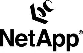
The Original NetApp Logo
 Reminiscent of the decades we left behind, the old NetApp was a classic design used to show associations with a high profile firm which the company would soon go on to become. The logo featured an arrow and what appeared to be two ‘Cs’. This made the icon for the logo while the word ‘NetApp’ was written in bold black letters.
An interesting thing about the logo was that it was designed to create a 3D effect – something that suited the innovative style of the company and its relation to the IT industry. However, as founder David Hitz said in his blog, many of the people did not seem to get the 3D relation and were simply left musing over what then appeared to be a structurally weird design.
Change in the NetApp Logo
 After sticking to their old logo for 12 years, the advent of 2008 got the executives thinking that it was time for a change. According to their website, NetApp developed their new logo after “extensive market research and testing”.
The new logo sports a blue gateway design with the company name written in white. As with most logo changes, NetApp too restructured its website and went one further by adding a new slogan which reads, “go further, faster”.
Looking into the Logo
On their website, the company stated that,
” The new NetApp logo is a bold blue gateway, designed to convey NetApp’s strong history in the data management business and its commitment to innovation and customer service. The new logo also signals an opening to the future—a gateway to new possibilities, new ideas, and new perspectives—enabling our partners and customers to move beyond barriers and experience business breakthroughs”.
In his blog too, Mr. Hitz was quick to mention that the new logo certainly did not display inherent characteristics of the company’s traits such as ‘innovative enterprise storage’, but he hoped that like the old logo, people would come to associate the company’s numerous qualities with their new brand identity.
To compare it with the new logo, I would have to say that the new color coding of blue and white is certainly much more visually appeasing and creative, while the new design carries the sort of abstract, artistic design that shows innovativeness along with the traits that the company wants to display. However, of course the old logo did sport that 3D effect and even though a lot of people had trouble deciphering the true design of that logo, I feel that we’re all going to miss that.
It is interesting to know that the new blue gateway logo was inspired by the Arc de Triomphe; a famous monument in Paris made to honor those French soldiers who died in the French Revolutionary and Napoleonic Wars.


