The origin of the Android logo seems to be shaky as it is airing dirt of being creatively adapted by another design source. Since the release of the logo, the speculation regarding inspiration has been a big question mark. Some put allegation on the originality of android logo by stating the fact that it has been driven by ‘Gauntlet: The Third Encounter’ an Atari video game.
Android logo designer, Irina Blok clears up the allegations and misunderstanding by answering the questions related to existence of bugroid. This bugroid is the open source and is designed to Android’s symbol to be displayed internationally. The theme selected by the founder of android was robot, so the team went through extensive research to formulate this final logo. Every design that you associate with your brand should be completely aligned with the logo. Because logo design is that one focal point which creates the brand’s prominence in people’s mind. They have a very heavy impact on what people think about your company.
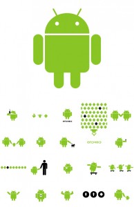
The first step was to develop a board of all kinds of robots and droid. Logo ideas were kept aligned with inspiration of android operating system. To explore various directions and visual languages was the second step which ranged from cartoony to realistic pixel based pictures.
The simplicity of the logo was kept in mind so it would trigger our user’s minds quickly. The design elements are associated very closely to the actual product or service the business is offering. They are more relevant to the brand values and engulf every aspect of the business you are running. It is also, to a great extent, responsible for the Brand Experience of your existing and potential customers. It helps you market different products to various customers keeping all the core brand values same.
The most basic symbol of a robot was selected as sketched by two designers and approved by the founder. Android mark made a statement of its own as soon as it was introduced to the market. It eventually became an international symbol of android by forming an emotional connection with the brand. The green color of Android logo was selected as it reminded of nostalgic code color, and for the fact that this color would make the logo stand out if places against dark background. This logo being a robot seems to be having a life of its own, as it has made its own identity other than being associated with android operating system. The logo went viral and got noticed by everyone in no time.
