One indication that evokes the Olympic emblem is the emblem of Audi AG. It would be reasonable to posit that awareness of Audi is ubiquitous, given that the company enjoys a similar degree of renown to that of the International Olympics. The automobiles produced by Audi are the result of significant technological advancements and have achieved remarkable success. These strokes of genius and masterworks of technological advancement are reflected in the company’s emblem as well. The four rings crest serves to convey the engineering principles that underpin the success of Audi AG products.
Audi AG – Emergence
Audi AG represents one of the most prominent and successful automotive manufacturing and sales companies in the industry. The company is headquartered in Ingolstadt, Germany, and is renowned for its luxurious and stylish sedans, ranging from super minis to crossovers. The automobiles are distinguished by their exceptional body shape, style, and features. Similarly, the price range is consistent. Audi AG is a privately held company within the Volkswagen Group and represents a prominent entity within the global automotive industry. The company was established on July 16, 1909, by August Horch and subsequently acquired by Volkswagen AG in 1966. This acquisition led to the resurrection of the company with a new series of Audi automobiles. The company name was derived from the Latin translation of its founder’s surname, “Horch,” which was then abbreviated to “Audi.”
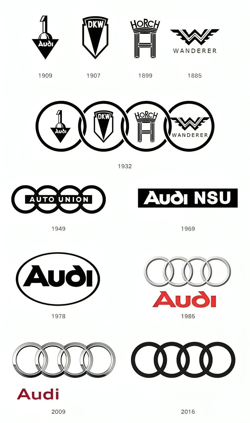
Audi Logo and its significance over time
The company’s logo constitutes a significant element of its marketing strategy. It facilitates the creation and dissemination of advertisements and promotional materials. Moreover, a more impressive emblem is likely to result in greater success for the company in question. The logo of Audi AG features four concentric rings that overlap one another in a sequential manner. Each ring represents a distinct trademark or brand of the Auto Union. The four rings in the logo represent the four brands that were previously owned by Auto Union: Audi AG, DKW, Horch, and Wanderer. The order of the rings corresponds to the historical sequence of brand ownership. There is a notable resemblance between the insignia of Audi AG and that of the International Olympics.
The original logo of the company was devoid of the lustre and tangible solidity that the rings subsequently acquired. The original logo was a relatively simple design, featuring a black and silver tint. The company name, “Audi,” is inscribed in red below the rings. It is stylized, bold, and centered. In 2009, Audi AG marked the anniversary of its establishment with a rebranding initiative that included a modification to its logo. The new logo exhibits a more refined appearance of the rings, which now evince a lustrous sheen akin to that of rings crafted from aluminum. In contrast to the previous illustration, the rings now evince a more organic and authentic appearance in aluminum silver tones. The text “Audi” underwent a typographic transformation, adopting a more minimalist font and shifting to the left while maintaining the original font color and boldness.
The Audi logo is an accurate representation of the technical innovation and lightweight design for which the company is renowned. The logo exemplifies the brand’s reputation for manufacturing reliable and luxurious automobiles. They are secure and a source of gratification for the global community. The emblem serves to illustrate that Audi is not only Germany’s leading automobile manufacturer, but has also established a presence on the global stage.
Audi AG is a prominent automotive manufacturer based in Germany. The company’s product range includes luxury motorcycles and automobiles. In 1909, August Horch established the company. The name “Audi” was derived from the Latin word “audire,” which means “to listen.” In Latin, the verb “listen” is translated as “Audi.” For over a century, the company has been at the vanguard of automotive technological advancement. As of 2009, the company employed 46,372 individuals across the globe, with total assets amounting to €16.832 billion.
Audi automobiles are renowned for their exceptional interiors and impressive performance. The brand is renowned for its commitment to safety, comfort, and sophistication, while also offering vehicles that are capable of rallying and high-speed performance. The Audi logo evokes the four automakers that merged to form the company. In 2009, the logo was updated to commemorate the centenary of Audi. The company’s slogan, “Vorsprung durch Technik,” translates to “Advancement through Technology.” This slogan is of particular significance in the context of the logo, as it enhances its visual representation.
Shape of the Audi Logo
The Audi logo is comprised of four distinct, sharply delineated, three-dimensional rings that are in register with one another and finished in a defined chrome. The logo is a representation of protection and power, symbolizing the Audi merger with three renowned automakers in 1932. The overlapping rings symbolize the strength of the company’s relationship with its customers and represent the unification of mergers. The Audi logo exemplifies the company’s unwavering commitment to enhancing efficiency, fostering loyalty, and pursuing excellence.
Colors of the Audi Logo
The chrome-colored Audi logo is a contemporary and sophisticated design choice. The brightness and sleekness of the design imbue it with a sophisticated quality.
Font of the Audi Logo
The Audi logo employs a sans-serif font, which conveys a sense of simplicity and style.
The new Audi logo maintains the brand’s progressive and modern image while encapsulating its core message. Vorsprung durch Technik. This is the inaugural instance in which the brand essence has been integrated with the brand, namely the four rings. In contrast to the previous logo, the new logo appears considerably more realistic, which is precisely the point at which one would expect to employ the use of a digital zoom. The new logo should appear as though it were a photograph.
The previous iteration of the Audi logo lacked a substantial degree of verisimilitude, exhibiting a somewhat contrived quality. The colors appear to be less saturated and are also of a higher quality. The degree of gloss is not particularly pronounced. Moreover, the typographical errors in the previous logo have been highlighted to a greater extent. Nevertheless, the Audi logo has already undergone multiple revisions. In consequence of the merger, a new logo was created for the first time which incorporated the four rings that had become a distinctive feature of the Audi brand. In this initial iteration, however, the respective logo exemplars of the four merged companies were still present within the rings. Subsequently, numerous corporate reorganizations occurred, resulting in the first documented instance of the Audi logo being utilized in 1985, coinciding with the company’s rebranding to “Audi AG.”
