
Disturbed is a very popular heavy metal American band that was nominated for the Grammy Awards several times. The band was established in 1996 and it consists of four members, Dan Donegan (guitarist), Mike Wengren (drummer), Fuzz (bass guitar) and David Draiman (vocalist). The original name of the band, before Draiman was asked to join the band was “Brawl “. After they changed the name of the band and put it all together, they launched their first album called “The Sickness” in 2000.
Their songs are soundtracks for a great number of very important Hollywood productions from their first album to their last one, the fifth. Even though from 2000 to 2011 they only released 5 albums the quality of the music is the one that matters and the quality of their music is amazing.
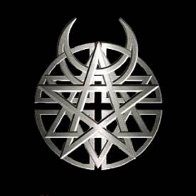
Disturbed Logo Design
The Disturbed Logo design is one of the most interesting. It is actually formed from four symbols put one on top of the other. The interesting thing is that all of the symbols are religious or have something to do with religion. Many have speculated what the connection is and why the band chose all religious symbols for their band logo that every part of the world will see and know. The skeptics of course say that it’s all satanic in some way because it’s rock music and all heavy metal is satanic, but of course this is not the case in any way.
On the internet, on the explanation of this logo there’s always a list of what symbols it contains and almost always is wrong, you can always find there “a Satanic symbol “, which is wrong. There is no satanic star in the Disturbed logo. The Satanic Star, the pentacle which is a 5 point star with two points up (not one) all in a circle, that usually has the head of a goat inside it because it fits perfect in the star, is nowhere in the logo.
The logo contains:
- A simple 5 point star – in legends this actually symbolizes the Spirit, earth, fire, water and air
- The Star of David – also known as “ The Jewish Star “ is the symbol of the Hebrew Religion;
- The Crescent Moon – it can be found in the Wiccan religion but also The Islamic one. In fact the symbol for the Islamic religion is a crescent moon with a 5 point star, and in the Disturbed Logo we can find both;
- The Sun Wheel or The Cross – it looks like a Sun Wheel which is also religious, but many speculate that the cross that it forms in the middle from the spaces is the important symbol in this design. The cross of course would symbolize the Christianity.
 The Star in 5 points
  The crescent moon
 Sun Wheel
  Star of David
Disturbed Logo Color
The color of the Disturbed Logo varies depending on context. The design of it never changes but the color can be anything that fits with whatever they are doing, from themed shows, flyers, posters, albums etc. Most of the times the color is really simple and this is how they started: a white background with the logo in black. Simple and clear, but something that has a deep meaning. The black color of the logo usually symbolizes the strength of the idea.
Conclusion
Most people know what every symbol from the Disturbed Logo means so when somebody doesn’t know anything about the band still sees this symbol as interesting. It is probably not one of the best looking logos on the market but for what it has inside it looks perfect. The way it combines the four religious symbols, it represents unity between all. This logo can represent the combination of religions, all in one, no differences, no disputes, no wars, all believing in one, it can represent a little peace, it can probably represent whatever you think it represents.
