Helping businesses grow – Equinix:
Providing a variety of services, especially for telecommunication businesses, this company founded in 1998 by the duo of Al Avery and Jay Adelson currently dominates the world’s internet exchange routing as well as traffic exchange which allows users of a particular cellular network to communicate with those having a different network. Due to its large share, it maintains a monopoly across the world due to the fact that telecommunications networks have to choose Equinix in order to remain competitive.
The company has 98 data centers in 12 different countries globally, under its mission of, “store, power and connect the internet.” Its growth has been so rapid that it now has more 2000 employees as estimated by recent reports.
Based in Foster City, California, Equinix’s revenue for the past fiscal year totaled around 1.6 billion dollars! The company went public in 2000 and within three years, in the fiscal year 03-04, the company became the best performing stock on the NASDAQ Stock Exchange.
Breaking of a new dawn –
Equinix redefines its logo:
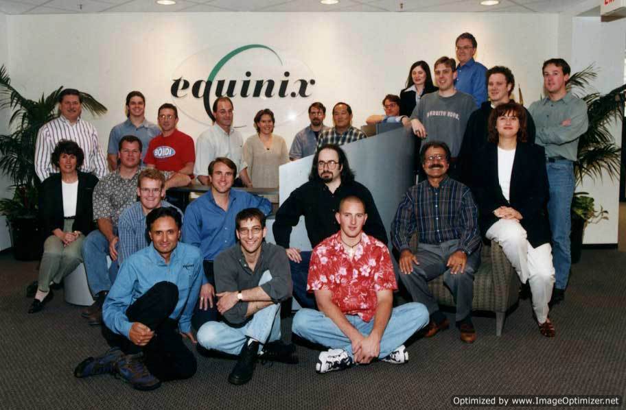
People who have not been up to date with the company’s forays in the past 5 years or so may still remember the company by its old logo, the one with the word ‘equinix’ written in an elegant, black font, with a half green and half black crescent shape in the middle which melds with the letter ‘q’.
In 2008 however, with the company experiencing larger interest from companies outside America, Equinix decided that it was time for a change. The year also marked its 10th anniversary so the company decided to unveil its new logo on that date.
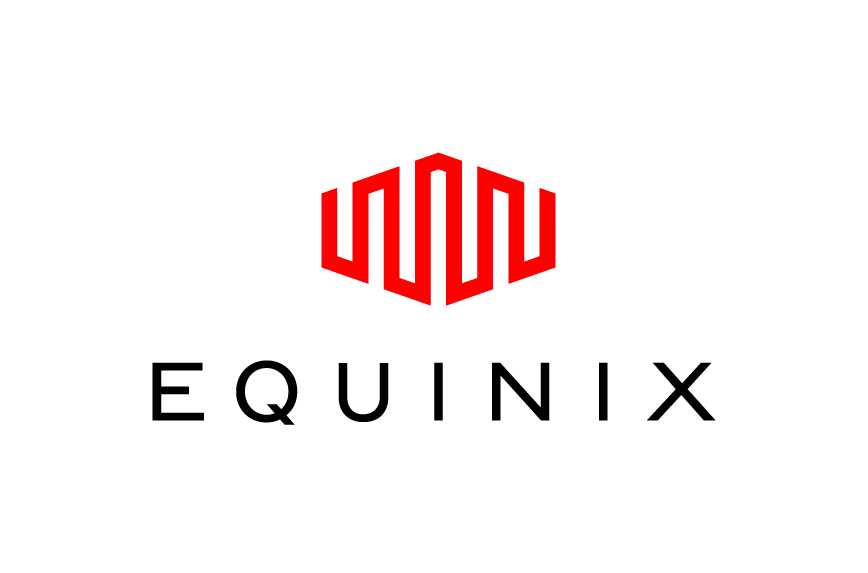
For the company to be successful, it is vital that they treat their clients’ information as confidential and protect them with vigilance. To show their sense of security and reliability, the company’s logo resembles a structure of a fortress.
According to the company, the new logo “represents a fortress structure, symbolizing the critical role that Equinix plays in safeguarding its customers’ information assets.”
The company also redesigned its website, changing the layout and adding an additional feature of video tours. Famous brand designer Addis Creson was given charge of both tasks – designing the logo and the website. The logo was designed to amalgamate the most important feature of Equinix’s services, namely, protection, connection, communication and perspective.
Our take on the new logo and what it represents:
The logo is certainly an attractive piece of artwork which clearly matches the theme with which the company works. The bright red color and the somewhat abstract representation of a fortress provides a fresh change for the company brand. Compared to the old logo, the new one is bolder, brighter and generally exuding more confidence which gives it that extra edge and allure. Set against a black background with the word ‘equinix’ written in simple white text, this logo also emphasizes on professionalism, while the simplicity of the logo makes it look more respectable and classy.
A brand that defines a rapidly growing company, the new logo represents the success that Equinix has had over the years. Currently, the company serves over 3000 customers worldwide including big name brands such as Google, Sony, Adobe and AOL. The scale at which it offers its services obviously requires a logo that illustrates its proficiency and trustworthiness.
Equinix has also branched out further in avenues that do not relate to business. It introduced the Equinix Foundation Charitable Fund in late 2000 and is an active worker in promoting environment-friendly production techniques some of which include, Deep Lake Water Cooling, Cold Aisle containment and constant research and development on creating new, more efficient conservation techniques.

