What Ford Logo is all about?
The biggest names in the automobile industry include yet another name which is no behind than the other automotive brands which is Ford. You walk through the streets and see Ford cars one after the other in variety of shapes and designs, all elegantly designed and intelligently engineered. If you own a Ford automobile, you can clearly “Feel the Difference” it has. Ford logo clearly identifies the vision, mission and values of the company. It envisages the company as the biggest and leading company for automotive products and services. It concludes that the company inherits a fulfilled legacy and is still steadfast in providing exceptional products. It reflects the company’s morals in doing the right things for the people, environment and the society.
Ford as an automotive company
Ford is a public company which comes under the category of automotive organizations. It was established on 16th of June, 1903 by Henry Ford. The name of the brand displays the name of its founder. Ford has its headquarters based in Michigan State of the United States, but distributes and sells its products globally that include automobiles and motorized parts. Besides the products line, the company offers different services too for automotive finance, automobile leasing and their servicing. Ford has four subsidiaries: Automotive Components, Holdings, Ford Credit and Troller. The two brands that are the owned by the company are Ford and Lincoln. The first brand is marketed worldwide while Lincoln, which appeared in 1922, is available only to North American countries and in Middle East.
The standards Ford has set for itself and for others to judge it put forth the company as the second largest automobile manufacturer in the U.S. and the fifth largest worldwide. 1914 started the Fordism all around the world.
The evolution of Ford logo
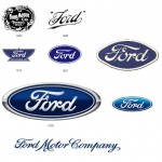
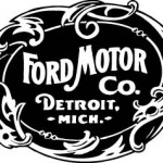
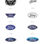
Like all the logos of big companies, Ford logo has also evolved with time and has a brief history associated with its evolution. The very first logo had an intricate design incorporating a “Detroit – Mich” tag and the brand’s name were written as “Ford Motor Co.”. 1912 brought with it the simple and impressive look to the emblem. The complicated design was altered to a simple oval shaped logo by C. Harold Will. It formally appeared publically in 1928. The background color was blue and the font was white and stylized. The company name was changed to “Ford” on the logo. Next emblem entails minor enhancements but more or less the logo was same blue oval emblem.
When the company was celebrating its 100th anniversary, the current logo was designed. Again minor improvements were made. It is still blue elongated oval, rather a slimmer oval version. There is an inside white thick border of the oval inside which “Ford” text is engraved in stylized, bold and white font color. The background colors are the shades of blue. The upper half of the oval has a lighter tint of blue while the lower half is comparatively darker. This modern logo is given the name “Centennial Blue Oval”.
Please check Official Ford website for more details.
