The Los Angeles Lakers is one of the most famous basketball teams in the world, based in Los Angeles California, USA. The Lakers play in the Pacific Division of the Western Conference in the NBA (National Basketball Association) and it is one of the most successful teams in the history of the NBA having won 16 championships, the last one won being in 2010.
Lakers Team History
The Lakers team began in 1947 in Minneapolis, Minnesota, when Ben Berger and Morris Chalfen purchased the recently disbanded Detroit Gems of the NBL (National Basketball League) for $15,000. The name was made up by the inspiration from the Minnesota’s nickname “Land of 10,000 Lakes”, so they became the Lakers. It didn’t take long and they got in the NBA in 1948.
In 1960 Bob Short decided to move the team to Los Angeles, California and that is where the best games of their life began.
Lakers Logo Design History
1947/1948 – 1959/1960
 The first Logo of the Lakers was back when the team was in Minneapolis. The logo has the map of Minnesota in white on a basketball as a background and Minneapolis is highlighted by a yellow star.
The abbreviation “MPLS.” in caps is present on top of the basketball with 2 stars on the left and on the right and the name LAKERS also in caps is under the basketball.
The colors used in the logo are yellow for the fill of the ball, the names and the stars, blue for the outline of every element in the logo and white for the fill of the map.
1960/1961 – 1975/1976
 The new logo from when the team moved to Los Angeles is different but not too different so that the people would still know it is the same team. It uses the same basketball like the last logo, and it always will. But now the name Lakers is put in the center of the basketball with Los Angeles on top of it. The font is italic with the L from Lakers bigger from the rest and The Los Angeles in a much smaller font. The colors used this time are different; the writing is purple and the ball is a green-yellow color with white accents.
1976/1977 – 2000/2001
 The next one is close to the final one. The ball is clear yellow with black accents, the font is exactly the same only the color is different; now the color is a light purple lilac.
The Final Lakers Logo
2001/2002 – present
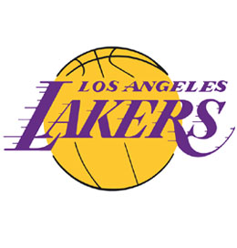
 The final Lakers Logo is practically the same as the last one the only change is the color of the writing; now it is a simple strong purple, and even though it can’t be seen on a white background the logo actually has a white contour.
They also designed a logo for the 60 year anniversary. It uses the same colors of the Lakers: purple, yellow and white. This logo is a bit more complicated; it is formed by a purple circle with “Minneapolis” in white, a yellow star and “Los Angeles” also in white, all of these on after another, another circle with the same yellow fill and a white contour, inside of it there’s a purple hexagon with a white 3D contour and inside this one there’s the number “60” written in yellow with a white contour; the next element is a white banner on the lower part of the circle with “anniversary” written in purple; the last touch is the name Lakers written under the banner in yellow with a white contour.
The Lakers Logo is one of the logo’s that will stay imprinted in the minds of sports fans and people in general and it captures the essence of what it represents perfectly.
