From Cars to Trucks – Mercedes Benz:
Mercedes Benz (popularly known as Mercedes) is well known around the world for its luxurious and state of the art cars though it also manufactures trucks, buses and coaches. The company runs under ‘Daimler AG’, a multi-national German automotive company which owns other companies such as Maybach and Freightliner.
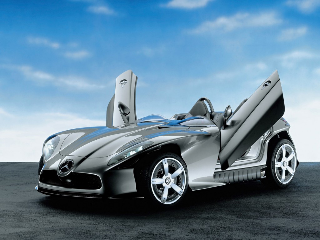
The company is named after Karl Benz, who is lauded for his creation of the first ever petrol-powered car. His company, Benz & Cie which was founded in 1883 was merged with Daimler Motoren Gesellschaft in 1926. The latter was a company of Gottlieb Daimler and Wilhelm Maybach who were engineers and industrial designers and are hailed as pioneers of internal combustion engines and the ‘four-wheeled’ vehicles.
The company was called Daimler-Benz AG after the merger and it was agreed that the brand name of Mercedes Benz would be used on their manufactured automobiles. Later, in 2007, Daimler-Benz AG was renamed to simply Daimler AG.
Mercedes famously partnered with McLaren cars in 2003, a popular name on the formula one racing circuit. Together they built a limited production sports car called the Mercedes-Benz SLR McLaren but production was ceased in 2009.
Today Mercedes Benz is regarded as one of the best automotive companies in the world today and is also the world’s oldest automobile manufacturer which is still in existence!
The Story Behind the 3 Pointed Mercedes Benz Star:

The Mercedes Benz logo that we see today was designed by Gottlieb Daimler and first seen on a car in 1909. Gradually, it evolved to the logo that is depicted on the picture above. The logo consists of a full metallic color scheme with a three pointed star encompassed by a circle. The three pointed star is used to show the dominance of Mercedes in land, air and sea. It was designed by Gottlieb to show that the Mercedes engine could be used in all three modes of transportation, thus showing its flexibility, reliability as well as the innovation of the company.
The sleek, metallic logo of present times shows us just how dominant this company is in the automotive industry. The logo is very simplistic yet contains a very rich piece of history and tells a very interesting tale. The simple design reminds us that sometimes, ‘less is more’ as this logo looks fitting on all Mercedes cars and has become a universally recognized symbol.
The fact that the logo does not bear the company name is a testament to the undying reputation of this very old company – the logo itself is enough. It also gives the impression of Mercedes as a very image conscious and evergreen company.
Mercedes Benz Logo Variations:

Before the merger between Daimler and Benz, the Mercedes car bore this simple logo with a tacky font which surprisingly looked very attractive and would certainly pass off as a good logo in anyone’s books today.

The three pointed star logo and Daimler’s vision were brought to life in 1909 with this logo featuring a gold color. The logo was trademarked in the same year.

This was the Benz logo in 1909 (remember, the two companies had not merged yet). It featured the company name surrounded by a laurel wreath and a combination of blue and golden colors.

The Mercedes logo in 1916

After the merger of Benz and Daimler and the formation of Mercedes Benz, this logo was formed in 1926. It mixed the 3 pointed star of Mercedes and the laurel wreath of Benz to form a unique and attractive logo.
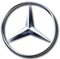
The latest logo in the series – a brilliant depiction of Mercedes’ dominance and imperialism in the automotive industry


