Metallica Logo a symbol for Heavy Metal Music
Metallica is one of the most notable bands of this music genre (heavy metal) in the entire world and in the history of the Music industry. This band was formed on 1981 in California when a group of music enthusiasts rallied to start it: Lars Ulrich is the band’s drummer; James Hetfield is the vocalist and rhythm guitarist and Ron McGonvey as the bassist.
Metallica in the beginning
Initially it was just Lars and James. They have been trying to make a band of three and they’ve posted ads about the much needed additional artist. It did not take very long until shortly after that they hired Ron, a bassist, and then everything was set to motion since. Their music was influenced greatly by the great legends Black Sabbath, Judas Priest, Led Zeppelin and others. With such great influences they were able to make great music both entertaining and fun! Metallica has over a hundred million in record sales in the international market. This is a mark that they had a very promising career ahead of them and that the general public supports their visions and goals. Few of their well known albums are: Master of Puppets (1986), Kill ‘em All (1984), Ride the Lightning (1984), Justice for All (1988), Death Magnetic (2008) -this is their last album. This album has thirty tracks in it that was released on the abovementioned year.
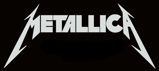
Simultaneously happening, any band created would usually have a logo, a symbol that is unique and distinct putting a distinguishable mark to set aside from other bands. This is the mark that will carry the name and legacy of the original simple goal that they were cultivating. Obviously, Metallica being a phenomenon did not waste much on the graphics or images whatsoever but went straight to the name of the band itself. The Metallica logo first created is pretty similar to the logo they used up to date.
The logo is basic, just using the letters all capitalized. The first letter “M” and the last letter “A” have distinctly elongated sides with spikes. This is a display of the static you get from the music they play for their patrons. These elongated sides and spikes screams Metallica even from afar. These spiky edges indicate the electrifying and intense performances they show and the level of entertainment they create through Heavy Metal Music!
A softer version of the Metallica logo has been created part of its evolution. This logo is more focused on the band name and less on the details. With the minimalism used on this logo it made it stand out more.
Hues and the Metallica Logo
The colors used on the Metallica logo are black and gray, both solid colors for Heavy Metal. The range of colors used in advertising varied over time. Though the classis look of the icon has been preserved different variations has been created as well. Fused with more current art styles, the Metallica Logo have lived through the years being reinvented but producing exactly the same electrifying performances!
The font type used in this logo was created by Ray Larabie also known as Pastor of the Muppets.


