Walking on the moon was the greatest of all the dreams of mankind. The dream was made true by none else than the great NASA. Modern technology and advancements in the field of science has answered all our fantasies and questions about the space. NASA is a name every child, every youngster and every older person recognizes, respects and salutes. Though they are like every other ordinary person, yet NASA people are considered out of this world and amazing.
NASA – National Aeronautics and Space Administration
NASA, National Aeronautics and Space Administration, is a result of National Advisory Committee for Aeronautics, NACA, mutation back in 1959. It was commented that the company would outdo in aeronautics and astronautics which it really has done. The roles and duties of the organization are divided into four key areas and these are aeronautics, exploration systems, science, and space operations. What people used to hallucinate some years back is now just a flicker away in intergalactic time and all thanks go to NASA.
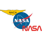
NASA insignia and seal
Like all big companies of the world, NASA too has a badge that is its icon. There are three authentic and official logos of NASA that are the NASA insignia, the NASA logotype and the NASA seal. It was the official NASA seal that comes forward first. It was used for much formal purposes like award presentations and press conferences. Sooner, the executive secretary of NASA felt the need of a more informal and public insignia for the company to get it recognized worldwide. The NASA seal was abridged by the head of Lewis’ Research Reports Division, James Modarell and named it the trademarked logo of the company. It consisted of white stars on a blue background shaped in a circle. A white orbit, surrounding the word ‘NASA’, and a red V shape vector sign or winged shape chevron, giving an illusion of constellation Andromeda, were also there. The circular design of the logo is synonymous to the planets’ shapes, the stars are a symbol of being in space, the orbit indicates the presence of a spacecraft and the red vector represents aeronautics. This streamlined version of the NASA seal was then its emblem and was named as ‘meatball’.
NASA logotype
In 1975, it was thought that the logo should be given a new and modern look that appeals more. So, a new ‘worm’ insignia was designed and approved by the Visual Identity Coordinator of NASA headquarters. It was the text NASA but in a worm shape with red appealing and rigorous color. This is what we call as NASA logotype and nicknamed as NASA worm by the company. It was used for marketing and merchandising until 1992. Later, it was discarded.
The NASA logo
is an exemplification of its vision “To reach for new heights and reveal the unknown so that we do and learn will benefit all humankind”. Looking at its logo, we all know what the company is meant for and what it is striving for. The emblem is a right justification of their endeavors to answer some of the basic questions related to space out there and how the mankind of the planet Earth could benefit from them. The NASA logo is a reflection of its achievement, the first and always remembered one is when Neil Armstrong and Buzz Aldrin walked on moon in 1969.


