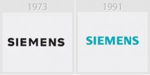
Siemens logo is a simple typographic logo stands symbolically for the corporation between partner and mutual growth. The new Siemens corporate identity guidelines were kept in mind designing this logo. In order to avoid misuse this logo is used in advertising and communication. The company says having a typo logo is the most succinct and precise way to express persona. That is the reason the logo is constantly used with great importance. Siemens throughout the years made sure that the size, combination and choice of colors within the text is handled with the care. Company has changed the logo several times, but the typographic identity of it is never ignored. Only this way Siemens will fix components and fulfill its functions that are to be identified by the market.
Since it is a typo logo, nothing much can be done about it. For its usage, the company has provided certain guidelines to be followed. The size of Siemens logo can vary as it is designed to fit to any format. It is easier to make it larger and smaller according to the design element which is the most beneficial part of the Siemens logo idea. Along with many other benefits associated with typeface logo of Siemens, we see that it can create an unmistakable visual appearance. It is the most important lay out related element to observe the rules. The bold font of the logo makes it completely visible, and the color used in the new logo is attractive and elegant to see.
The typeface used by a corporate logo is a key element of its design. This device has a dual function, rather, a transition of binary information. Two separate communication channels have their benefits and disadvantages. The first channel of communication is verbal. This is the easiest to understand because it is the everyday matter. The verbal nature of typography is the transmitted words belonging to the language, that is, what is written in the font you choose. In this case, the typography plays a passive role, which transmits information element is the word. The other channel of communication is not so common. It is a parallel to the verbal channel, called “non-verbal”. This fulfills a different function of transmitting information, but subconsciously, in a way that the receiver cannot interpret the message. This channel is the one that conveys a message from the typography itself, actively.
Requirement of simplicity and integrity makes it impossible to develop a logo design review using two or more fonts. An exception may be only a text logo, with no graphics, fonts, where due attention is concentrated on the main man. Different parts of the logo are contrasted with the color. The most natural and common variation is to change font weight that allows you to focus on the company name in the logo, slogan or select company.
As for color, the logo should be ideally designed so that even in black and white, they never lost its sense conveyed inherent in its information base. Specify the color of the logo, many face difficulties. Printing on a variety of texture materials entails the continued shift hue, not to mention the printer. The logo will be printed on the packaging of goods, on business cards, souvenirs, letterhead, and outdoor advertising layouts.


