Unless you have been living underneath a rock your entire life, you have most likely seen the Dell Logo. But, how much do you really know about it? Today we are going to tell you a little bit about the history of the Dell Logo and help you better understand the meaning behind it. You’ll be surprised by how something so seemingly simple can have such a big story behind it. 
History Of The Dell Logo
Previous to the year 2010, there were a few different versions of the original Dell Logo. While all of them were very similar, they gave the company much depth; almost as if they had multiple personalities. 
Towards the end of 2010, the company decided to finally change things up a bit. They created a mixture of their first three logos and added a bit more to it; creating a logo that is truly unique as well as eye catching.
While the differences may not be noticeable right off the bat, there are actually quite a few things going on there that you may not notice at first glance. The letters were been moved slightly to the left on both of the ‘L’s and the ‘E’ was tilted a bit more downward.
The logo uses the font Museo and pressed the characters closer together, creating a circle around the entire display; which is inside a blue square. The words, ‘The power to do more’ are underneath the circle.
Meaning Behind The New Dell Logo
What many people love most about this article is the fact that the words ‘Dell’ are contained within a circle. The color blue is bright and represents (according to Color-Wheel-Pro.com) “Blue is the color of the sky and sea. It is often associated with depth and stability. It symbolizes trust, loyalty, wisdom, confidence, intelligence, faith, truth, and heaven.” These are all things that relate to Dell wonderfully. This company has been something so many of us have grown to trust over the years.
Another thing you may have noticed about the logo is the fact that the circle seems to represent the Earth. Let’s think of it as the ‘Earth of Technology’; meaning Dell is all you need. This has become true for many Dell customers. Who needs any other computer company when you have found one so perfect for all of your needs? 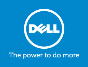
Changes Needed: Dell Logo
So, why the sudden change for Dell? Why didn’t they just decide to keep multiple versions of their logo? The answer is simple. Back in 2007, the company had over 800 creative agencies working on their brand and there were over 15 different typefaces for the company as well as different variations in those fonts. This all just seemed too complicated for the company.
Changing to old Dell Logo seemed to be the best choice the company ever made because it showed their commitment to their customers. Having more than one logo can portray a company as being unstable or unsure and too much change can confuse customers.
The newest Dell Logo gives a great overall company vibe.
