Every company needs to change their brand image after certain time. Logo is the main representation of brand image, so it is the first thing to be changed. Logos become outdated and customers get bore seeing the same image over and over again. To refresh the image in customer’s mind, Companies opt for logo change.
Pepsi is known for being one of the biggest companies in the world. The success has come with a lot of hard work and innovation throughout the years. Besides the processes, Pepsi has been innovating in terms of logo designing as well. Whatever the design has been, Pepsi never gave up with its association of colors. Pepsi unveiled a new makeover and launches its new corporate logo. Owner of the Pepsi brand has decided to revamp its image with a visual change in your current logo now returns to evolve under a new aspect that tries to convey the concept of changing times and changing itself.
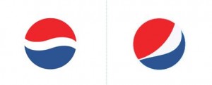
Now we have new logo of Pepsi introduced in 2008. The typography of the letters is lighter, slender and curved. It seems very modern and readable to the customers. The figure of the logo has undergone radical changes, maintaining the three primary colors, red, blue and white. However, now all three colors are shown differently with new curves showing irregular figure. Pepsi executives indicated that they wanted to show a smile. Honestly, I never got to see a smile there, all I found was more white smoke or something.
This makeover is a millionaire change because the world must be updated to corporate image. In my opinion the change is unnecessary, and Pepsi’s image was etched in our brains. It seems that when you do not know how to innovate your product and you prefer to change logo. Pepsi Co has introduced types of drinks which show the innovation in their product. When they realized that they have concentrated enough on the product line, the logo idea change came into life.
By the way, the logo will not be static, it will change shape depending on the product, supposedly to emulate the form of different smiles. The characteristics of the new logo designed by the Omnicom Group retained the main features of its previous version but introducing corporate certain variants or modifications in the ways of representing the features of a slight smile. Also, some visible changes were made in the brand fonts.
This change has directly affected the design, merchandising and its products packaging as they soon began to bear the new brand logo. The curious thing is that this new change came at a sensitive time for company and everything seemed to news of lost profits and firing employees, the announcement of the new logo appears to be subject to careful marketing strategy.
This last logo was very successful, and so far the greatest memorial had generated among the public. You can say that after 1998 Pepsi logos are designed to give a greater role to the symbol. The new image of the company, created in 2008, shows several significant changes in the design of this, also the font that is used, more stylized and lowercase. Pepsi’s logo examples through out the years has potitioned them in the mind of the customers.
