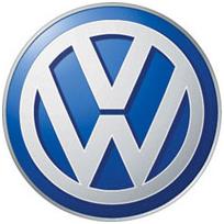
How many of you know that Volkswagen has redesigned its logo, it’s a three-dimensional logo with chrome effect. Logo Designer reviews that with the use of new logo, the old one is now gradually replaced. VW logo is clear, simple and memorable. The VW logo constitutes a logo in its purest form, because it’s actually really simple. It consists of the abbreviation of the company name (VW) and briefly drawn a circle around it.
The car maker has launched not only the new Golf, but also revamped its logo strong. Three-dimensional logo, with modern contours and shadows throughout the upbeat has positioned itself quite well. Hence, the trademark comes with the big V and the big W so now. New logo of VW illustrates the claim of their brand. It is modeled on the existing vehicle logo and takes on its three-dimensionality. By using chrome effects it shows the representation of very high quality.
Logo idea of new logo is appreciating as it is precisely its simplicity has made the logo already so well known. The symmetrical design and the similar shape of the letters allows the viewer to the logo memorize quickly and simultaneously demonstrate a graphically elegant combination.
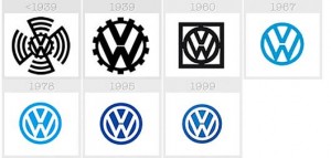
In 1948, VW had to protect the logo trademark. However, there was still no determined color definition. In the course of the 50s, the logo was then printed in more and more blue on white and later wards implemented. Meanwhile, company uses blue as the background color and white as text color. Since 2000, the logo has a three dimensional character. It was decided to revise it, as the logo is no longer appropriate and therefore had wanted to symbolize a small break. On the other hand, composition has changed but nothing more is done to the logo details.
Who designed the logo originally at old times is not known. There is currently a dispute going on as to where it should be clarified that who has invented the logo. What is known is that the change was made in 2000 by Meta Design. MetaDesign is Germany’s leading agency for corporate identity, corporate design and branding. They have also been working among others for Roland Berger, Lufthansa or eBay.
How the new VW logo is recognized at first glance than what it stands for – Volkswagen. Wait for a bit fresher, bolder, more modern image of the company. When and where exactly the new emblem is used is not yet clear. A real chrome effect, as one might expect to use after the two brands Seat and Audi is not evident in the new logo. Instead of the previously used cautiously shadows they used effect on the caps, and tried with the help of accumulated using some shades of gray, to imitate an appropriate look. The blue tint has become much darker, increasing the contrast within the logo decisively.
The new logo is nothing but lost one of his statements and the carrying capacity of the letter “V” and “W”, but does the new brand image is significantly more restless than previous one. Reality is that the eye does not specify at which line it wants to move along. Some might say that the separation of the two capitals is almost an insult, but actually it is the main factor of the logo being so memorable.

